Crispie

Redefining Local Breadcrumbs for the Modern Home Cook

Sub-Brand Identity and Packaging System

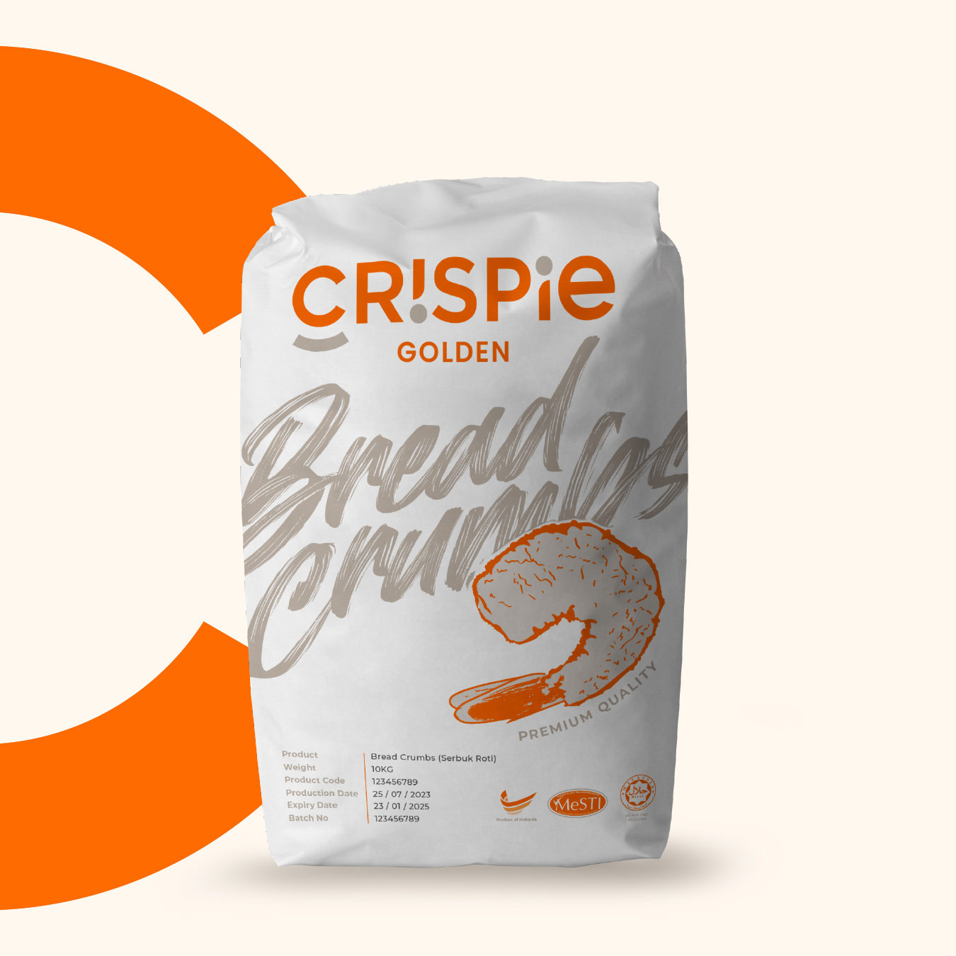
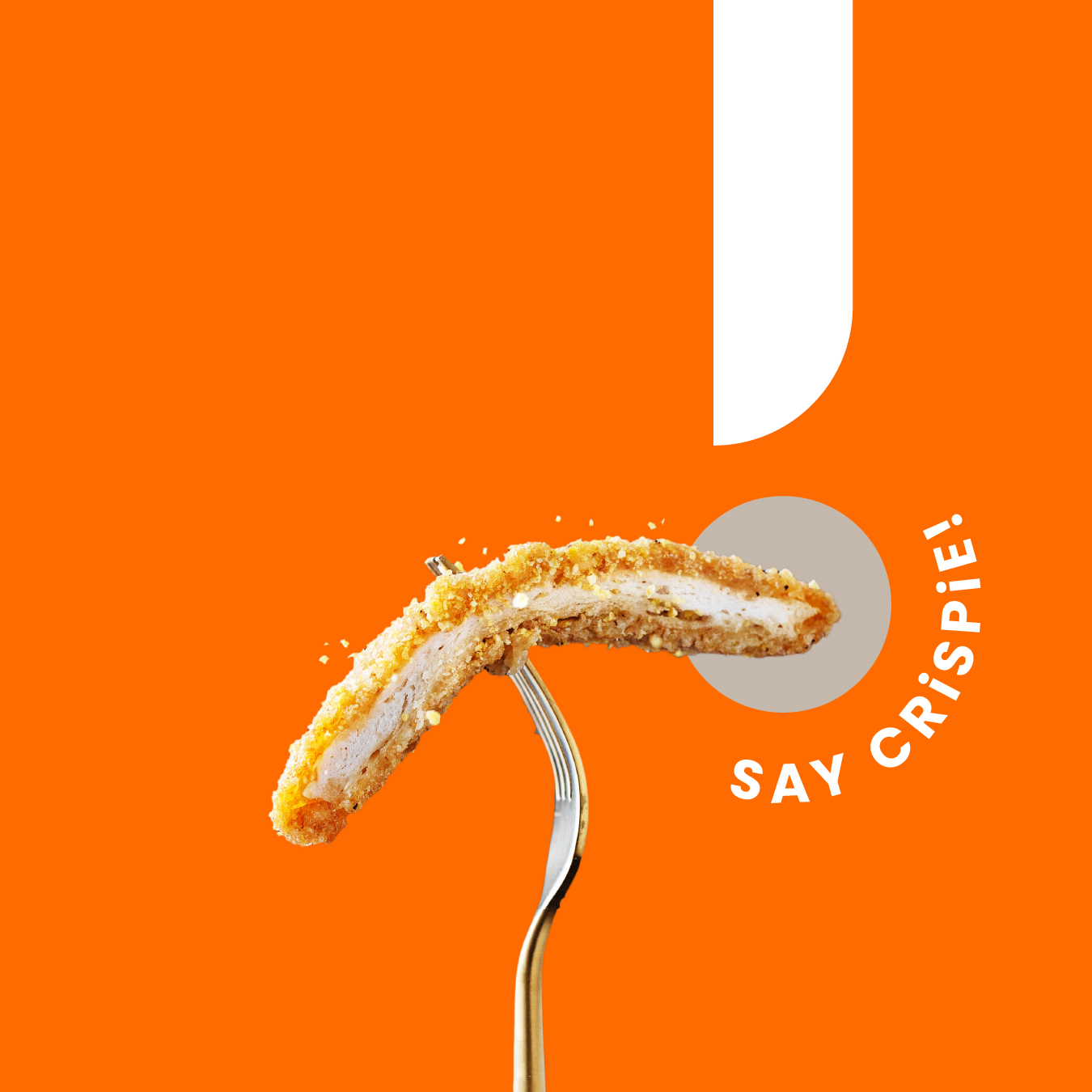
Born from Malaysia’s pioneer breadcrumb manufacturer, Crispie is a high-energy retail sub-brand designed to shake up the local grocery aisle. Tailored for young home cooks, air-fryer enthusiasts, and busy kitchens, Crispie turns a traditional pantry staple into a fun, crunchy, and effortless everyday food experience.

Crispie made easy

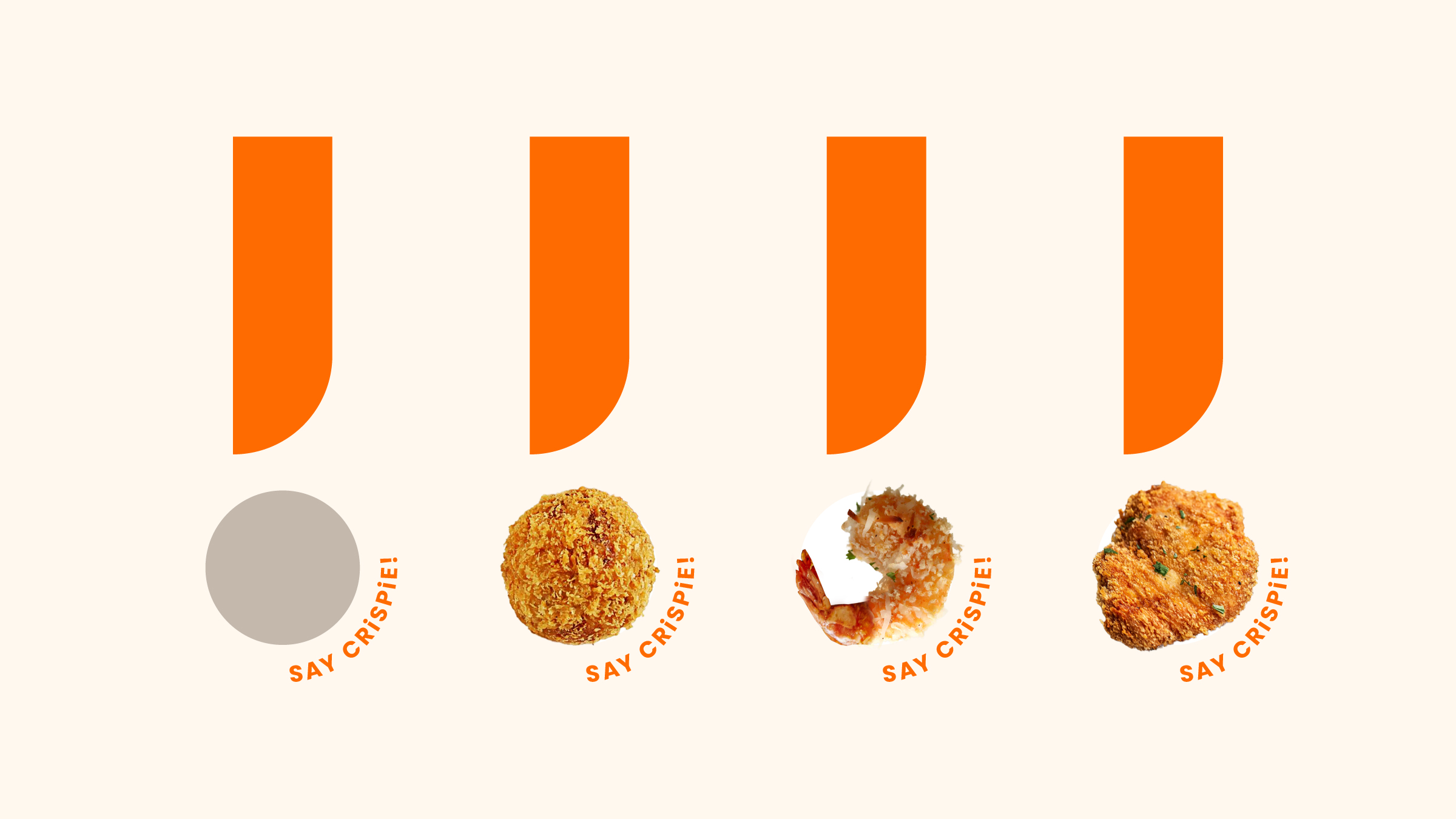
To instantly communicate warmth, joy, and crispiness, we developed an expressive, high-contrast visual identity rooted in playfulness:

The Smiling ‘C’ Brandmark: The hero logotype transforms the initial ‘C’ into a playful character, with a cheeky wink, broad smile, and crunch-star sparkle — giving the brand a friendly, memorable personality.

High-Impact Colour Blocking: Vibrant sunburst yellow, fiery orange, and crisp teal replace conventional packaging, creating a bold and appetising presence on retail shelves.
Coining the Language of Crunch

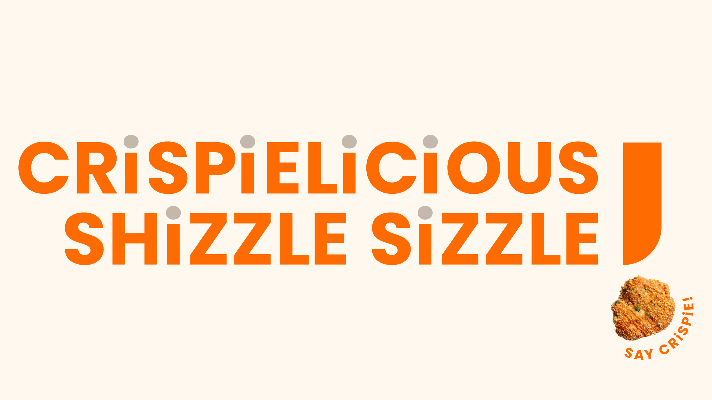
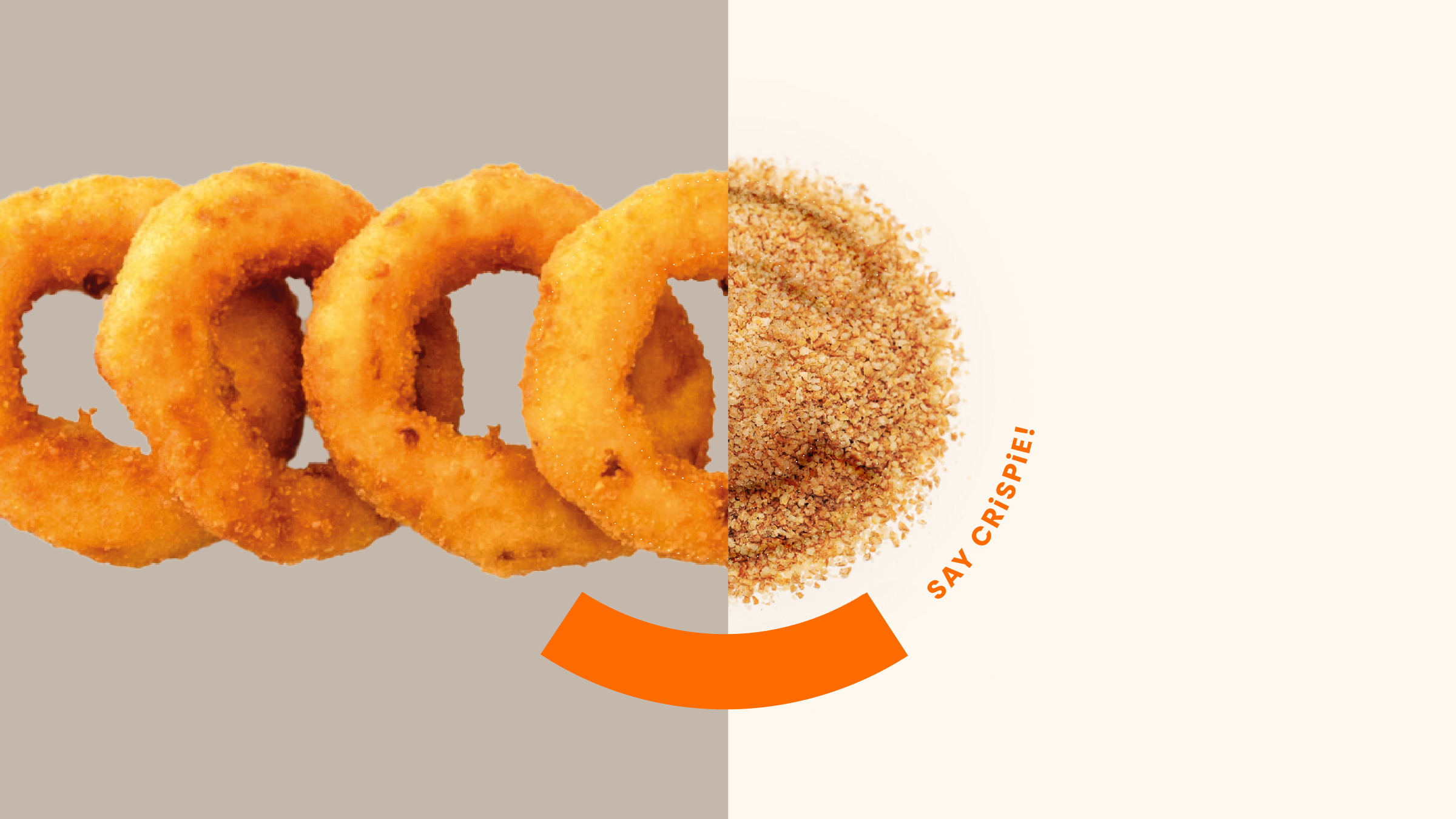
To speak the language of younger, social-first audiences, we developed a brand voice packed with energy, wit, and custom-coined vocabulary.

Functional Utility Meets Vibrant Retail Impact

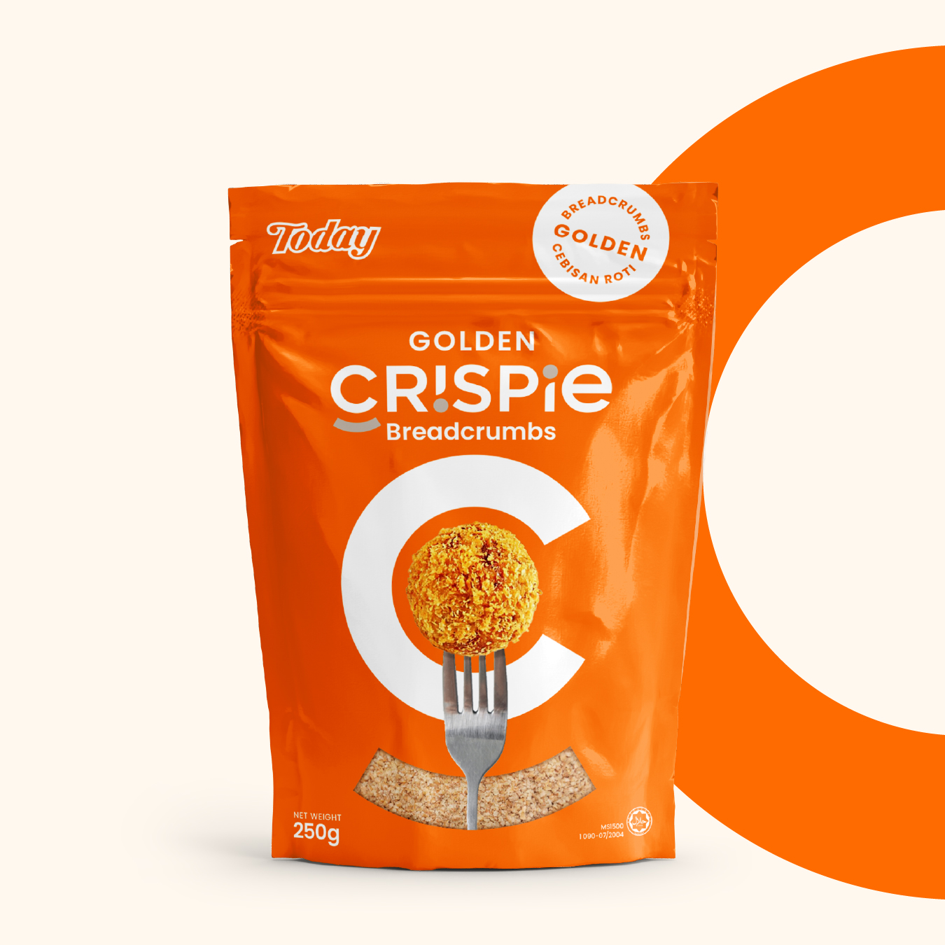
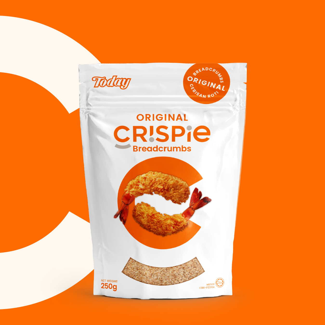
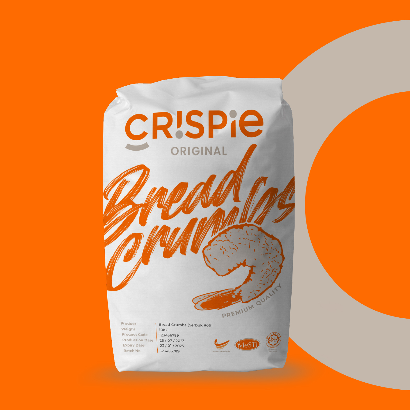
High-Visibility Color Blocking: Moving away from dull transparent bags, we introduced bold, appetite-stimulating color blocks that command attention on local supermarket shelves.

Resealable Stand-Up Pouch: Designed for real-life cooking—keeping the product upright, preventing pantry spills, and locking in freshness for repeated use.